Bucking Fit Life

My Role

Sole UX Designer
Tools Used

Figma
Notion
Photoshop
Project Scope
Mobile-First website
Maze
Fitness Site
Branding
Duration
2 Months - Started (03/01/2022)
Responsive website
Information Architecture

Empathize
After conducting qualitative research through stakeholder interviews and user interviews I was able to create an empathy map that helped give me an idea of what our goal should be. In order to verify this assumption I used site metrics and user surveys
The Goal
Design a mobile-first website that allows users to get personalized workouts, nutrition, and mental wellness advice on the go.
Insight #1
Limited time
91.7% of users said that fostering a healthier lifestyle was important to them. The problem nearly everyone had, according to surveys and interviews, was a limited amount of time in their chaotic schedules. The amount of time users had to workout varied from 15mins to 2 hours.
Insight #2
I don’t have that…
Users frequently expressed their frustration with competitor apps for introducing workout equipment they didn't have in the middle of their exercise routines. This interruption often led to users feeling disheartened and annoyed, causing them to abandon the program altogether.
Insight #3
Overwhelming
Users are seeking a simple and guided system to help them navigate the abundance of workout options available. With so many programs and exercises to choose from, it's easy to become overwhelmed and unsure of where to begin. Providing a clear and concise pathway for users to follow not only simplifies the process but also promotes adherence to an exercise routine.

Define
To ensure I was solving the right problems for this project, I conducted a competitor audit, created problem statements, personas, and user journey maps for those personas. This gave me a better understanding of the user's needs, pain points, and goals, allowing me to ideate solution that effectively addresses their needs.
Problem Statements to Personas
Problem Statement #1
Macia, an actor, experiences difficulty maintaining a consistent workout routine and healthy eating habits due to her unpredictable schedule. Our solution should provide Macia with a convenient and adaptable online approach to fitness and nutrition, allowing her to achieve her health goals and feel accomplished.
Problem Statement #2
Wade, a stay-at-home Dad with a young child. Finding workouts that meet his needs and fit into his busy schedule can be a challenge. Our solution should provide him with a range of flexible and adaptable workout options, allowing him to spend less time thinking about his health and more time with family.
User Journey Map’s
Macia
Creating a user journey map for Macia helped us understand the importance of providing a step-by-step process for workouts and nutrition. This insight was key to developing a solution that met her needs and helped her achieve her goals.
Wade
Wade's user journey map showed us that it was important to provide clear information about the gear and time commitment required for each workout. This insight helped us design a solution that met his needs and helped him fit workouts into his busy schedule.

Ideate
Since this project involved a significant revamp of the existing system, I placed great emphasis on Information Architecture to ensure a solid foundation. After laying out a potential system, I created User Flows to verify its effectiveness, and then proceeded to ideate through Crazy 8's and paper wireframes.
Previous IA System:

Proposed Sitemap:
To effectively structure the content, I divided it into three main categories: Fitness, Nutrition, and Mental health. Each of these main categories had two sub-categories, Classes and Blog posts. However, I also encountered some specific content that didn't quite fit into these sub-categories. To address this, I created dedicated branches within each main category for any unique content that fell outside of the established sub-categories.
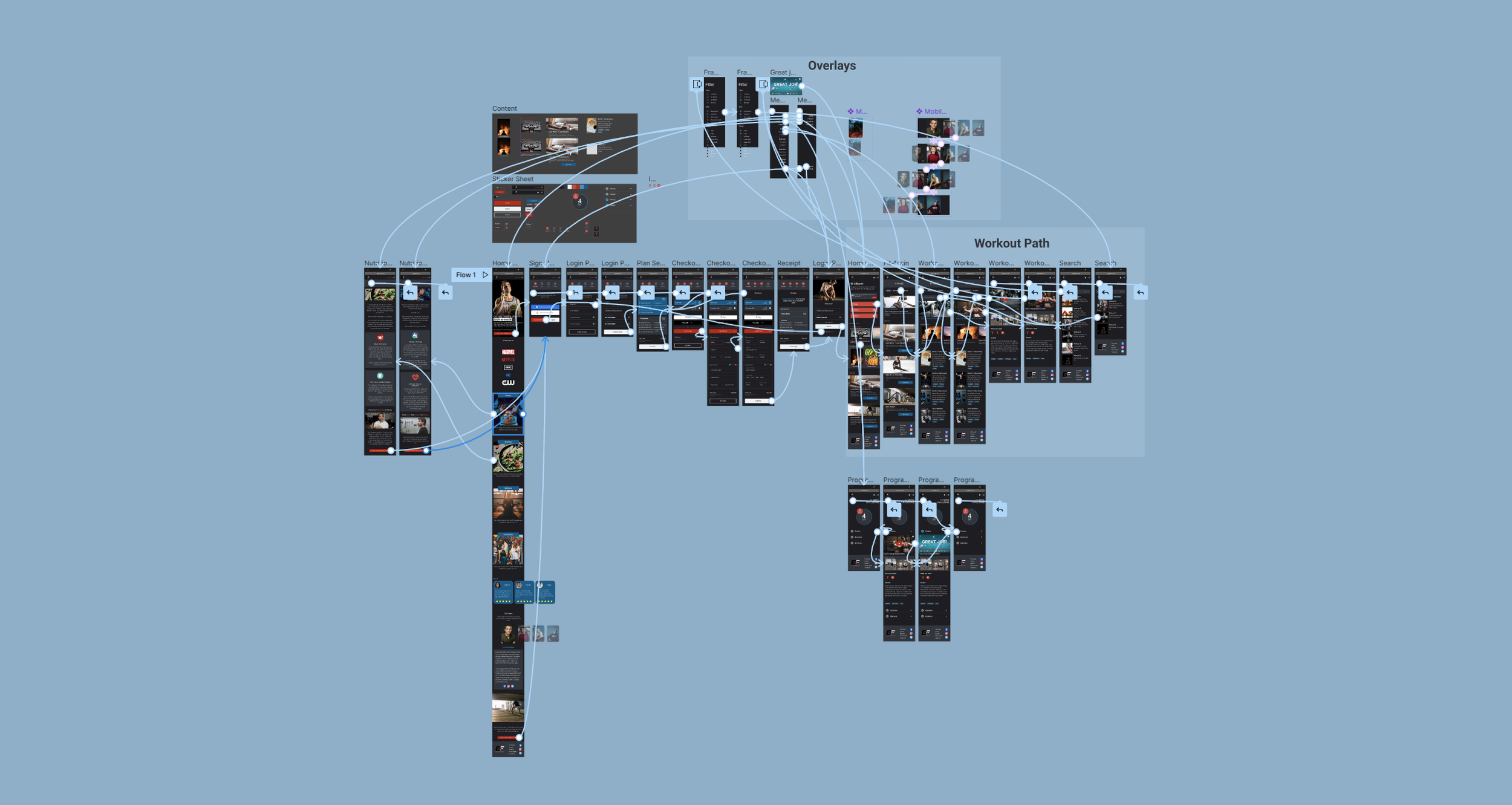
User Flows
To get a better understanding of how users would interact with the new information architecture, I created some user flows. These visualizations were crucial in mapping out the steps users would take to complete specific tasks.
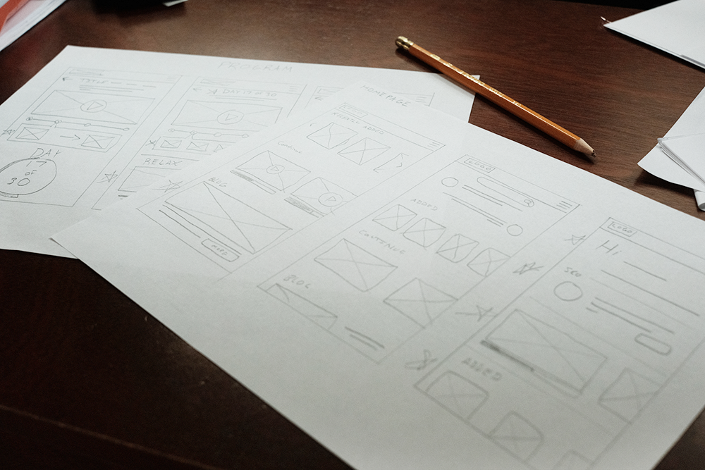
Paper Wireframes
Creating paper wireframes allowed me to iterate on the main interaction points and ensure that I was effectively addressing user pain points. I focused on the homepage and programs page, as these were the areas where users spent the most time.

Prototype
Now that I had a pretty good idea of what the layout of information should look like and some paper wireframes for reference, it was time to dive into digital wireframes and prototypes. Using figma where I created both Lo-fi and Hi-fi prototypes.
Digital Wireframes
Keep it simple
As I moved into the digital design phase, I focused on the feedback I received from user research to ensure that the homepage didn't overwhelm users with content. I also wanted to make it easy for users to find and continue workouts they had previously started. I did so by putting a “recent” section on the homepage.
Checklist System
Creating a space that would walk users through a program was both important to the overall user experience and the shareholder’s vision. Creating a simple checklist system allows users to walk through an extensive list of content without being overwhelmed.
Lo-Fi Prototype

I used the digital wireframes to create a low-fidelity prototype, which allowed me to test the primary user flow, including sign-up, login, starting and continuing programs, and searching for workouts. This helped me identify and address any issues with the design before moving on to higher-fidelity prototypes.
Usability Studies
It’s not always rainbows and unicorns
Conducting usability studies throughout the design process helped me identify and resolve issues before moving on to hi-fidelity prototypes. In the first low-fi study, most users had few issues with logging in or continuing programs, but almost all had difficulty finding workouts - a key pain point for users. To address this issue, I focused on improving the workout search experience.
Only 3 out of 6 testers used the hamburger menu to find the workout section, indicating that it was not prominent enough or that there was not a clear enough path to the different sections of the site. To address this issue, I focused on making the menu more prominent and creating a more direct path to the different sections.
Refining the designs
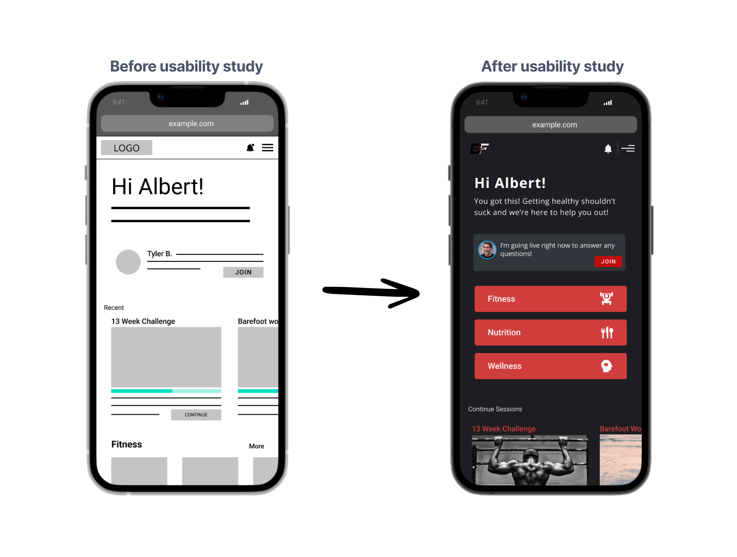
To improve navigation, I placed the main website navigation items directly on the homepage, allowing users to easily access the majority of the website without going into the menu. This helped address the issue of users having difficulty finding the menu system.
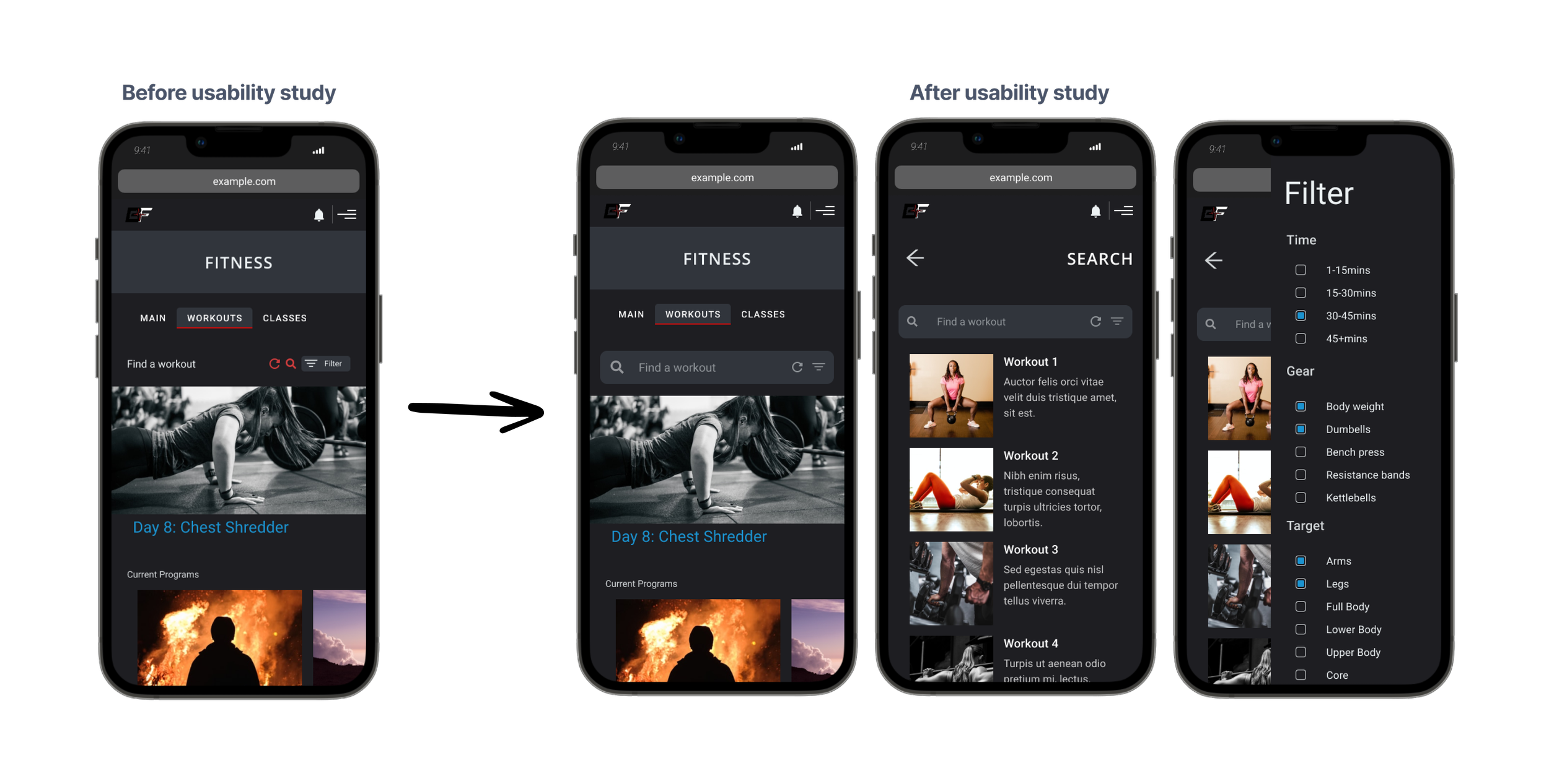
Following the second usability study, I found that users were still having some difficulty finding new workouts. To address this issue, I replaced the small, inconspicuous search feature with a prominent search bar. This directed users to an in-depth search page where they could easily narrow their search to fit their specific needs. This improvement helped users find workouts more efficiently.
Hi-Fi Prototype
The high-fidelity prototype provided a smooth sign-up process and addressed key user pain points, improving the overall user experience. This was a crucial step in the design process that allowed us to test and refine the website's features and functionality before launching it.
Don’t forget it’s a website!
Although this design was created with a mobile-first approach, it was important to ensure a positive user experience on desktop as well. To accomplish this, I created a high-fidelity prototype of the website for desktop testing.

“Final” Testing
The testing phase can repeat itself multiple times before going into development. I ended up plugging my prototype into Maze in order to get a more accurate look at how users interacted with the new design.
Were users able to easily find health and wellness content on mobile?
Remembering the goal!
Although not “perfect” we did see a huge improvement from our first couple usability tests. Nearly all users were able to achieve their goals and access content through either searching, continuing, or starting a new program.
Avg. Time on Page
67.6s
89.5%
Success Rate
9/10
SUS Testing
Usability testing was very informative. Users spent a little over a minute on each page and the success rate went up to 89.5%. I also used a System Usability Scale to gauge how users felt about their experience and if they would be likely to use the app, 9 out of 10 people said they would be likely to use it.

Accessibility
Since receiving my W3Cx Web Accessibility certification I’ve found a new passion for creating content that can be enjoyed by everyone. Creating accessible designs is at the forefront of my design process and here are just a few of the ways I have implemented it in this design.
Consideration #1
Contrast
Maintaining contrast on websites within WCAG guidelines is essential for ensuring content is easily perceivable and accessible to all users, including those with visual impairments. This not only benefits users with disabilities but also enhances the user experience for all users, leading to improved engagement and satisfaction.
Consideration #2
Dark Theme
Dark mode can provide benefits for accessibility by reducing eye strain and improving contrast, making it easier for users to read and navigate content. Additionally, dark mode can be particularly beneficial for users with visual impairments, such as light sensitivity or contrast sensitivity, by reducing the glare and improving legibility of the content.
Consideration #3
Icons
Icons can improve the user experience by visually communicating information quickly and efficiently. They can also help reduce language barriers, making your design more accessible to a wider audience. Additionally, well-designed icons can enhance the overall aesthetic of your interface, making it more engaging and visually appealing.

What’s next?
While this product is very close to the development phase I still need to design mockups for the other sections of the website; Nutrition and Mental Wellness. Once the stakeholder is comfortable moving forward I will dive back in and start problem solving!