Camelbak
My Role

Sole UI Designer
Tools Used

Figma
Photoshop
Project Scope
Exploring Figma Features
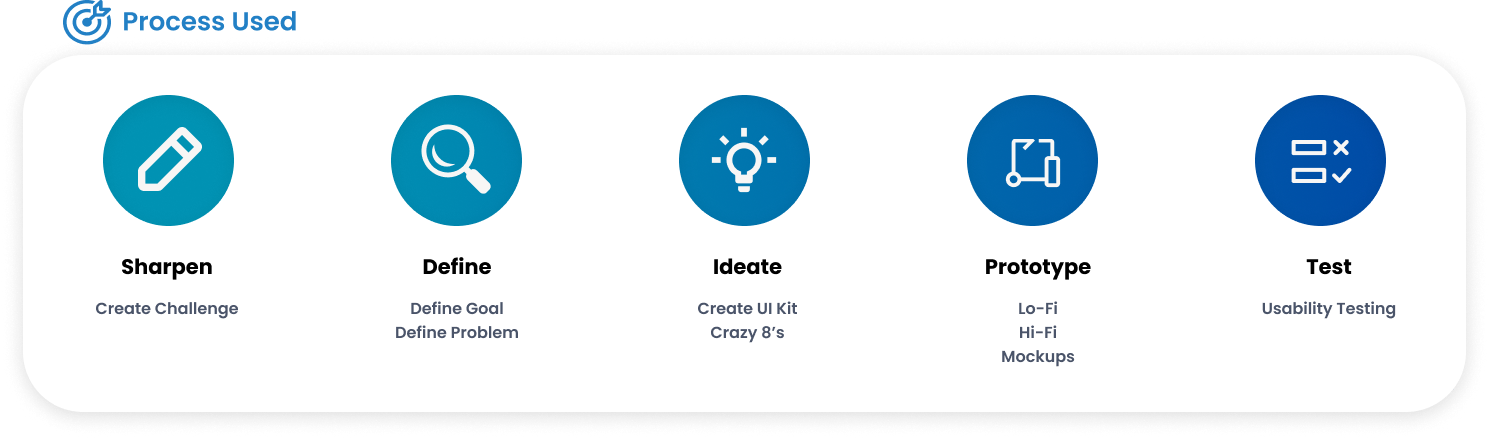
Sharpen
Personal Project
Shopping Experience
Duration
5 Days - Started (01/31/2023)
Sharpen
Using Sharpen I was able to create a design challenge. This challenge would allow me to practice and improve my UI design skills while also being empathetic towards users.

Define
This project goal was fairly simple to design, since it was laid out pretty clearly in the design prompt. Even so I wanted to make it a little more specific so that I was still focusing on the users.
The Goal
Design an intuitive purchasing flow that provides a seamless and engaging experience for Camelbak customers.
Ideate
In order to jumpstart this project and quickly generate a variety of design ideas, I chose to focus on two specific ideation processes: Crazy 8's and creating a UI Kit.
Crazy 8’s
Crazy 8's allowed me to quickly generate a variety of purchase flow ideas for Camelbak. By setting a time limit for each sketch, I was able to overcome creative blocks and come up with unique solutions. This ideation technique also helped me identify potential design issues early on and address them before moving forward with more detailed wireframes.


UI Kit - Assets
To challenge myself in this UI design project, I aimed to incorporate as many design aspects as possible into components. This allowed me to optimize the use of component variations and effectively reduce the number of pages in the prototype. Despite this, I was able to maintain brand consistency throughout the design using consistent color and typography.
Button Placement
No need to hunt
After refining the wireframes into a low-fidelity prototype, I made the decision to keep a prominent "Add to Cart" bar at the bottom of the app. This allows users to effortlessly adjust their quantity and make a purchase as they shop, without having to hunt for a buy button.

Prototype
Now that I had a pretty good idea of what the layout of information should look like and some paper wireframes for reference, it was time to dive into digital wireframes and prototypes. Using figma where I created both Lo-fi and Hi-fi prototypes.
Hi-Fi Prototype
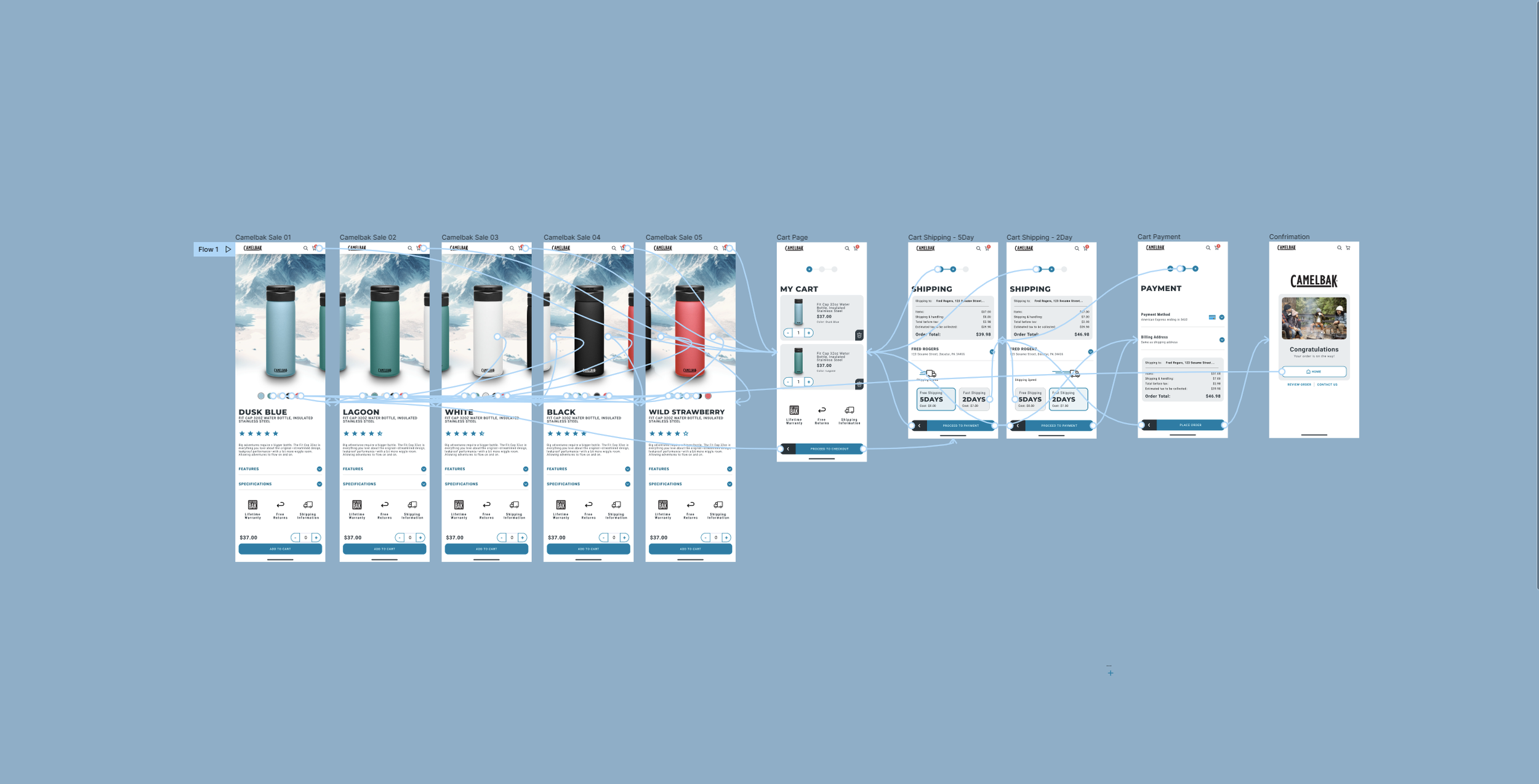
The final high-fidelity prototype features a streamlined user flow with that takes users from the store to check out in only three steps. Using variant components I was able to reduce the number of pages needed to make the Hi-fi prototype. Each menu and button can be changed in this component tab allowing all the buttons and tabs to be changed across the prototype by accessing the correct component.

Accessibility
Since receiving my W3Cx Web Accessibility certification I’ve found a new passion for creating content that can be enjoyed by everyone. Creating accessible designs is at the forefront of my design process and here are just a few of the ways I have implemented it in this design.
Consideration #1
Contrast
Maintaining contrast on websites within WCAG guidelines is essential for ensuring content is easily perceivable and accessible to all users, including those with visual impairments. This not only benefits users with disabilities but also enhances the user experience for all users, leading to improved engagement and satisfaction.
Consideration #2
Keyboard Access
Many users rely on keyboard navigation to browse the internet, so websites that don't support it can be frustrating and even impossible to use. By making sure your website is keyboard accessible, you're providing equal access to everyone, regardless of their physical abilities. This also makes your website more user-friendly and easy to navigate for all users, not just those with disabilities.
Consideration #3
Icons
Icons can improve the user experience by visually communicating information quickly and efficiently. They can also help reduce language barriers, making your design more accessible to a wider audience. Additionally, well-designed icons can enhance the overall aesthetic of your interface, making it more engaging and visually appealing.

What’s next?
I will be focusing on more UX designs. Although if a new feature comes out in figma or there is a new trend I will likely create another prompt and make sure I’m capable of achieving those goals. Staying up to date with the latest technology is extremely important to me.