Food4life
Food4life is an Atlanta-based non-profit that's responsible for delivering free groceries to those in need during the Covid-19 crisis. The organization needs tools that allow those in need to easily sign up for assistance without having to jump through hoops in order to receive aid.

The Problem
A large portion of people living paycheck to paycheck cannot afford groceries for themselves or their family. There is also a lack of transportation in those communities, which can make it difficult to go to a food pantry to receive aid.
The Goal
Design an app that would allow those in need, on any platform, to easily order groceries directly to their house for free.
As the Lead UX Designer
I was responsible for conducting interviews, paper and digital wireframing, low and high-fidelity prototyping, conducting usability studies, accounting for accessibility, and iterating on designs.
User research: summary
I used the data from participants who are in need of assistance to understand what their needs were in comparison to what help is available in the Atlanta area. Most users found other food assistance programs lacked a delivery option for food and often only provided a meal or two rather than a week's worth of groceries. The also rarely offered a delivery option. Pairing that data with the abilities of Food4Life I was able to clearly define the goal for this app. Users needed a way to easily, without going through a whole background check, order groceries to their door.
User pain points

Lengthy forms and bureaucratic business practices of many non-profits prevent a large group of people from receiving aid when they need it most.

Without access to transportation, many people have limited options for getting food, since many delivery services are expensive.

Those who are at risk of catching Covid-19 must isolate from other people, this has caused many to lose their jobs.
Persona: Mike P.
Problem statement:
Mike is an at-risk and unemployed person who needs a way to get groceries delivered for free because there aren’t options easily available through other programs

Persona: Angela C.
Problem statement:
Angela is a struggling mother who needs to know that her child will have food because her job and time don’tv allow for her to get groceries often.

Paper wireframes
When I first went through the ideation process I was mainly focused on allowing participants to “shop” for their groceries. Sadly this wasn’t a possibility for the organization because the food they can provide is limited by donations. I instead focused on the simplified homepage and form process.

Digital wireframes
After ideating and drafting numerous paper wireframes I decided to go with a very simplified home screen for the app without any distractions or clutter. Most users expressed their dislike for complicated forms and having to jump through hoops in order to find assistance. This design allows the users to navigate the app without frustration.

Low-Fidelity Prototype
The low fidelity prototype was created before getting the input from food4life. This means it included a shopping feature to choose groceries. This feature ended up being changed.

Refining the designs
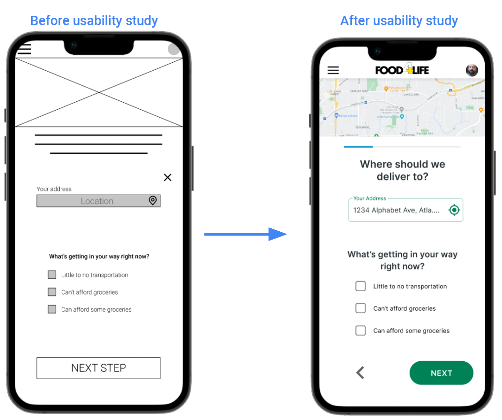
Users wanted an easier way to navigate to previous steps and the home screen. A back button was added to the bottom left and the logo at the top middle will take users to the home screen. This should address the participants’ concerns.

Users wanted a way to checkout without having to set up a login since most didn’t foresee them needing groceries often. Because of this, I added a “Proceed without Account” option.
Mockups
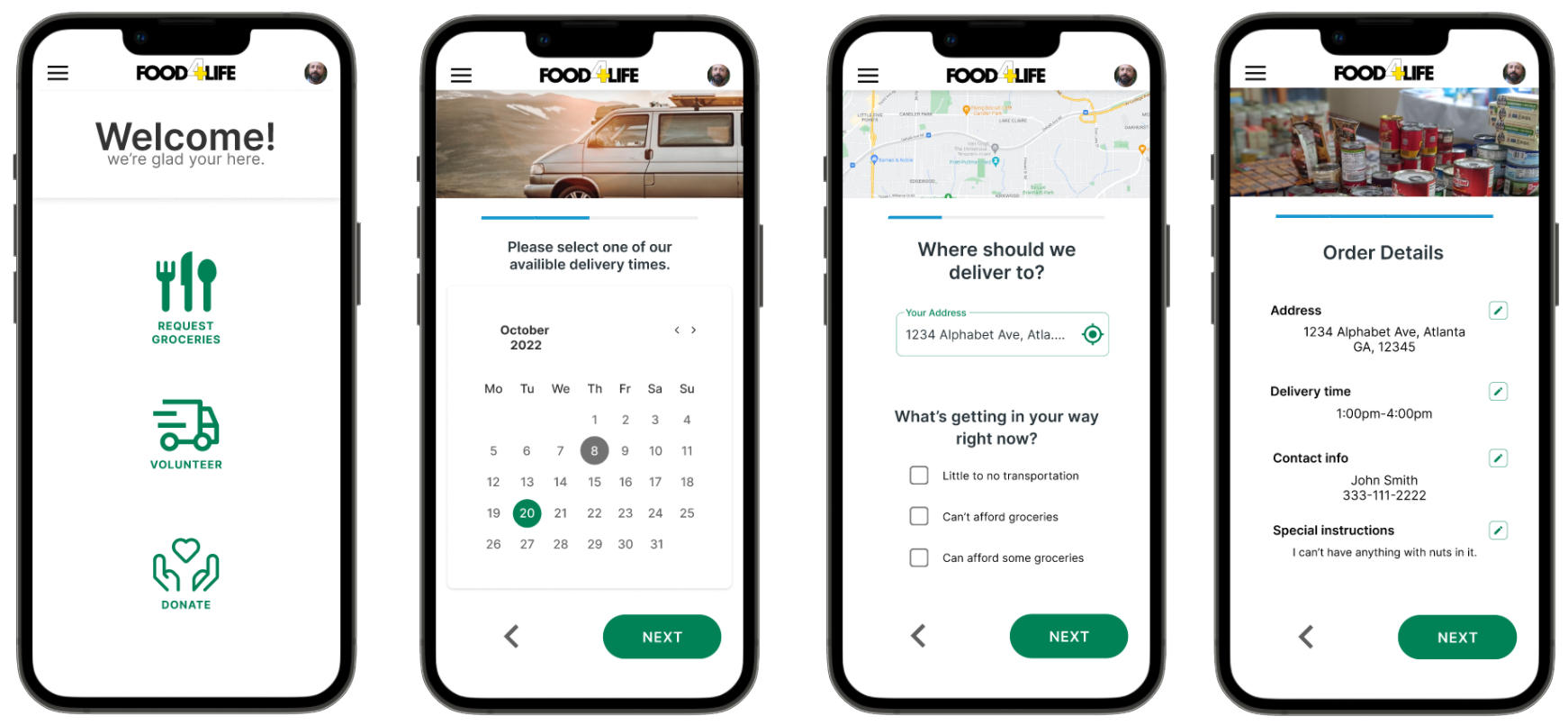
High-fidelity prototype
The high-fidelity prototype follows a similar flow as the low-fidelity version, just without a shopping aspect to it.

Accessibility Considerations
All colors were chosen with accessibility in mind. Meeting all contrast requirements for those who are visually impaired.
All icons include a brief title below them. This should allow those using screen readers to easily find and navigate the app and website.
Added a “notes” section to the ordering process so that those with accessibility concerns can voice them to those putting their order together.
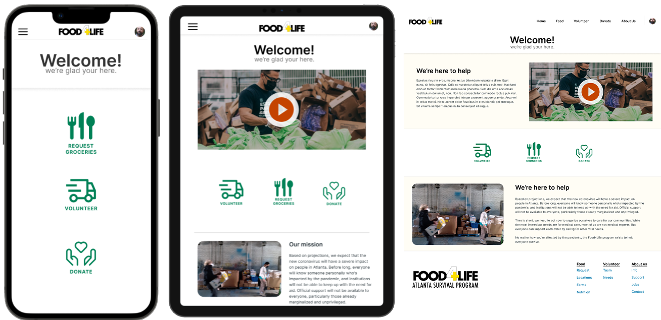
Responsive designs
The responsive designs are made for Mobile, Tablet, and Desktop experiences. I designed each variation to meet the needs of users on each device. The bigger the device the more accessible details about operations become while still maintaining the simplicity users wanted.
What I learned
I need to make sure I speak with the shareholders prior to making the first low-fidelity prototype. Understanding their capacity allows me as a designer to more accurately assist users with their journey.
Next steps
The next steps for this project are to dive deeper into the profile and tracking capabilities with the app and make sure they align with the shareholders’ ability.
Contact.
me@travisjsawyer.com
Thank you for taking the time to review my work on the Abuelas Café app! If you would like to see more of my work or get into contact with me, my contact info is below.