UX Portfolio

My Role

UX Designer
Tools Used

Figma
Notion
Photoshop
Project Scope
Responsive website
Maze
UX portfolio
Branding
Duration
2 weeks - Started (03/01/2023)
Empathize
The use of Metrics and affinity mapping allowed me to gain insights into user behaviors and preferences. This allowed me to identify a specific goal that needed to be achieved in order to increase engagement with my portfolio.
The Goal
Revamp my portfolio so that Hiring managers can easily skim the material and find all essential information quickly.
Insight #1
Limited time
Recruiters often have limited time to view UX portfolios, typically spending just a few minutes reviewing each one. Therefore, it's important for UX designers to showcase their best work upfront and make their portfolio easy to navigate, ensuring that their most important projects and skills are immediately apparent to the recruiter.
Insight #2
Who are you?…
Recruiters appreciate it when UX designers introduce themselves on the first page of their portfolio. This helps them gain an understanding of the designer’s strengths and approach and allows them to make an informed decision about their suitability for the role.
Insight #3
Information overload
Having too much information in case studies can be overwhelming and difficult to read. This can make it difficult for recruiters to quickly identify the key takeaways and understand the design process. In addition, having too much information can make it difficult to keep the reader's attention.

Define
In order to define the correct problem with my portfolio design I decided to focus on creating problem statements, personas, and doing competitive analysis. This allowed me to create a design that users are familiar with, engaging, and informative.
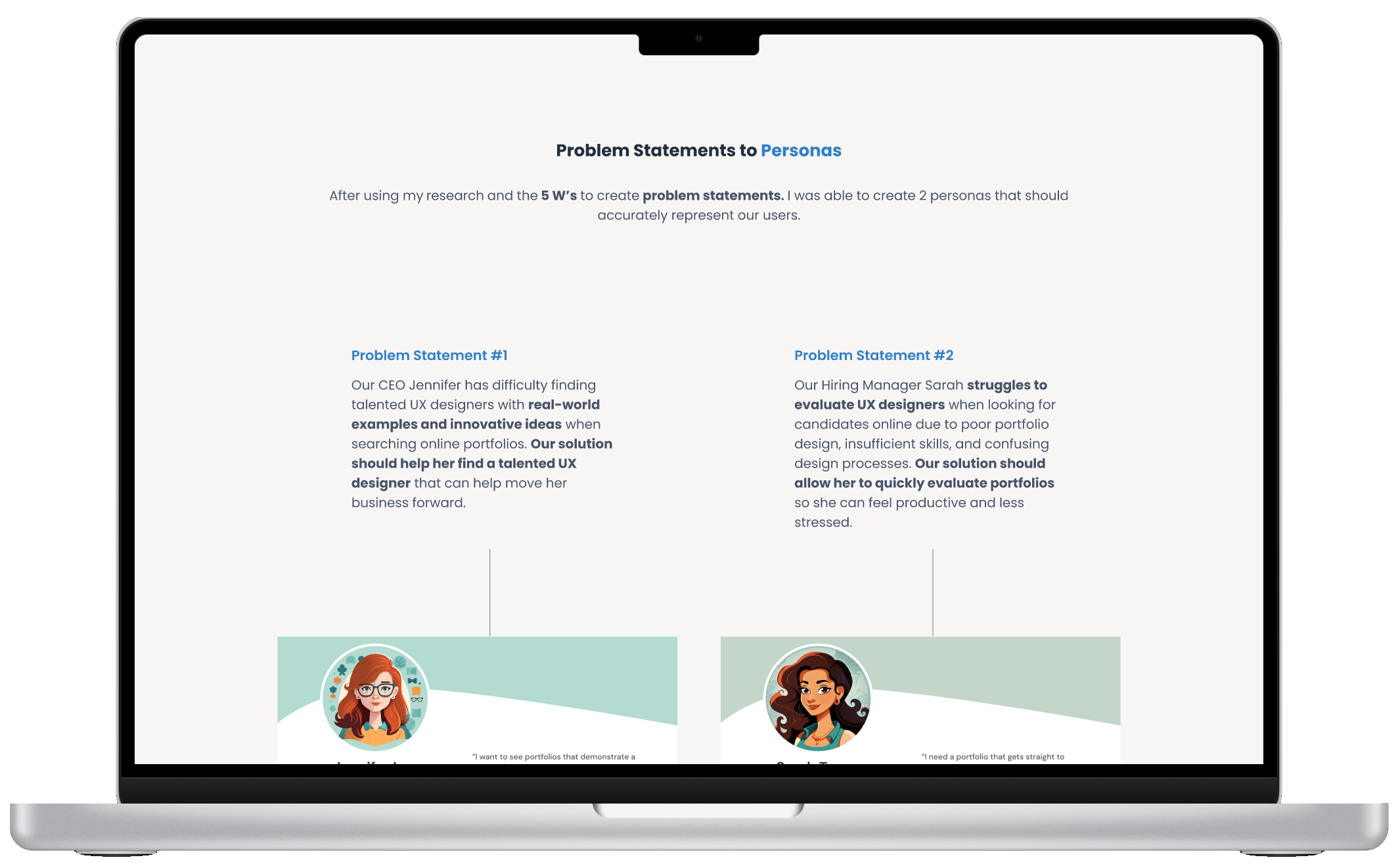
Problem Statements to Personas
After using my research and the 5 W’s to create problem statements. I was able to create 2 personas that should accurately represent our users.
Problem Statement #1
Our CEO Jennifer has difficulty finding talented UX designers with real-world examples and innovative ideas when searching online portfolios. Our solution should help her find a talented UX designer that can help move her business forward.
Problem Statement #2
Our Hiring Manager Sarah struggles to evaluate UX designers when looking for candidates online due to poor portfolio design, insufficient skills, and confusing design processes. Our solution should allow her to quickly evaluate portfolios so she can feel productive and less stressed.
Competitive Analysis

The competitive analysis uncovered some helpful insights into what recruiters found helpful while searching for candidates. This served extremely helpful in the Ideate phase of the design process.
Ideate
Since I wasn’t trying to reinvent the wheel with my portfolio I found it important to Ideate fast. Because of this, I decided to focus on an easy-to-navigate sitemap and use crazy 8’s to find interesting ways to showcase material. I also wanted to create a UI Design System that helped users quickly ingest information.

Crazy 8's is a fantastic way to quickly visualize different design iterations. For this project in particular it was much faster to create wireframes during the prototyping phase than on paper. As a result, my ideation phase naturally flows into my prototyping phase, enabling me to iterate and refine my concepts in real-time.
UI Design System
In order to allow users to view content easily I wanted to find typography that was easy to read, Poppins was one of my favorites. As for color, I chose shades of blue in order to create a sign of stability and reliability in the design. I then chose a warm white to provide more color contrast with the blue, since they are opposing colors.

Prototype
Since I’m extremely familiar with Figma I decided it would be faster to create wireframes in the software than on paper. Once I was happy with my wireframing I moved on to the Lo-fi prototype, testing, and then Hi-fi Prototype.
Lo-Fi Prototype
During the lo-fi prototyping phase, I had the opportunity to experiment and explore various wireframe options. Rapidly iterating through different ideas enabled me to discover a layout that was both streamlined and effective, prioritizing the most critical information at the top of the information hierarchy. Ultimately, this process allowed me to craft a design that was both aesthetically pleasing and user-friendly.

Does it work?
Testing the design is a critical phase, gathering feedback from users allowed me to identify potential issues and areas for improvement, which I then addressed by making necessary changes and adjustments before investing significant time into the design. This approach has proven successful in my past projects and has become one of my go-to methods for ensuring that I'm on the right track.
Hi-Fi Prototype
The Hi-fi prototype let me dive deeper into the design and create more refined solutions to the problems my personas were having fast. It also allowed me to start testing the design much faster than I could have if I went straight into the development phase.

“Final” Testing
The testing phase can repeat itself multiple times before going into development. I ended up plugging my prototype into Maze in order to get a more accurate look at how users interacted with the new design.
Were users able to find information fast and efficiently?
Remembering the goal!
Since the define phase allowed me to create a goal that should solve our user’s biggest pain points. It was extremely important to gather insights during the usability study that would let me know if I was able to achieve that goal. The results were fairly promising!
Avg. Time on Page
32.7s
100%
Success Rate
8.8/10
SUS Testing
Usability testing was pleasantly surprising. Users spent around 30 seconds “skimming” pages for information. Users had a 100% success rate when navigating to the requested content. I used a SUS to gauge how successful users felt the site was at letting them skim content, the site received an 8.8/10 in the SUS testing.

Accessibility
Since receiving my W3Cx Web Accessibility certification I’ve found a new passion for creating content that can be enjoyed by everyone. Creating accessible designs is at the forefront of my design process and here are just a few of the ways I have implemented it in this design.
Consideration #1
Contrast
Maintaining contrast on websites within WCAG guidelines is essential for ensuring content is easily perceivable and accessible to all users, including those with visual impairments. This not only benefits users with disabilities but also enhances the user experience for all users, leading to improved engagement and satisfaction.
Consideration #2
Keyboard Access
Many users rely on keyboard navigation to browse the internet, so websites that don't support it can be frustrating and even impossible to use. By making sure your website is keyboard accessible, you're providing equal access to everyone, regardless of their physical abilities. This also makes your website more user-friendly and easy to navigate for all users, not just those with disabilities.
Consideration #3
Alt Text for Images
This provides a textual alternative for users who are unable to see images on a website, whether due to a visual impairment or slow internet connection. By including descriptive alt text, you're enabling all users to understand the content of the image and its relevance to the page. This not only makes your website more inclusive but also improves your website's accessibility and SEO. Plus, it's just good practice to ensure that your website is as informative and helpful as possible.

What’s next?
I will continue to work on my portfolio and use metrics from Squarespace in order to gauge the effectiveness of the content and design. Will users spend time on more pages or leave without exploring further? Did I solve the correct problem? Or do I need to re-examine and iterate on the design some more? I can’t wait to find out! I also have intentions to add a UI Labs tab where I will post UI projects so I can keep UX and UI separate. I need to do more user research before I implement that though.